
Harrods X Pantone Teach The Art of Colour
Just when we thought our winter blues would never end (are we there yet?), we had a haute minute to focus on some real colour.
London-based, luxury department store Harrods has paired with Pantone to create (and totally tease us with) a spring 2019 colour palette a.k.a. The Art of Colour. And we are willing style students!
The Harrods X Pantone collaboration dreams up nine swatches to inspire our future wardrobe wishes from the metallic, to the rustic, to the pastel—we say bring on the new season…and all the fashions that come with it.
Study up on the hues below, complete with ‘Harrods’ notes’:
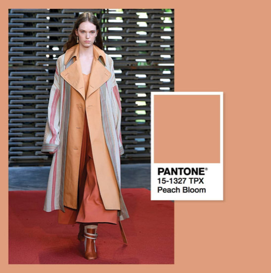
Peach Bloom
“Immediately wrapping you in a friendly embrace, it lifts the spirits with the promise of a welcoming, joyful experience.”
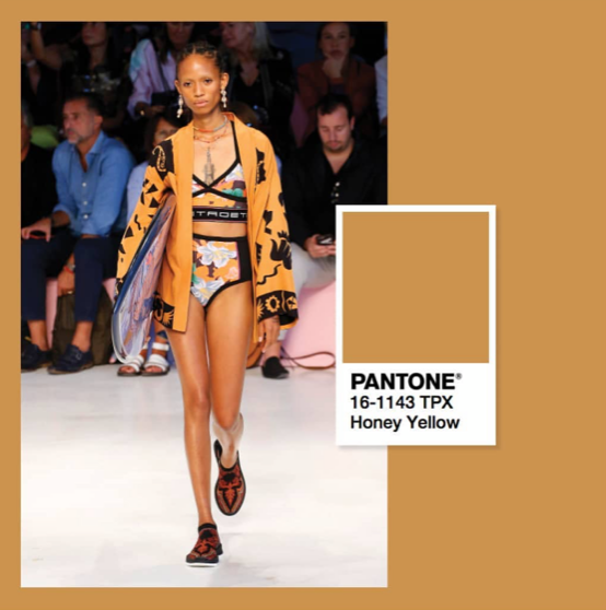
Honey Yellow
“The golden hue nourishes mind, body and soul with its comforting glow.”
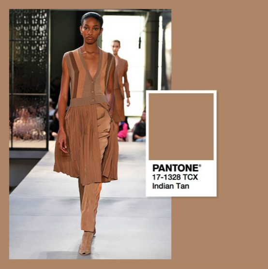
Indian Tan
“It’s a woody tone that you know you can rely on.”
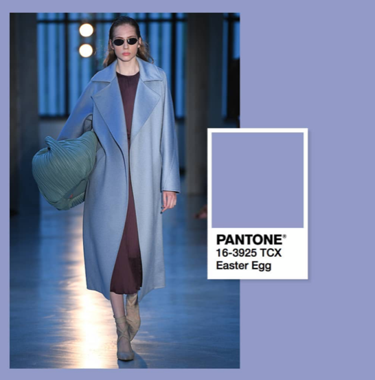
Easter Egg
“Free spirits and creative types will see the charm in this happy, head-turning shade.”
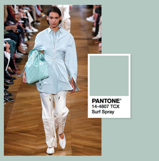
Surf Spray
“This cool, misty tone has an alluring serenity.”
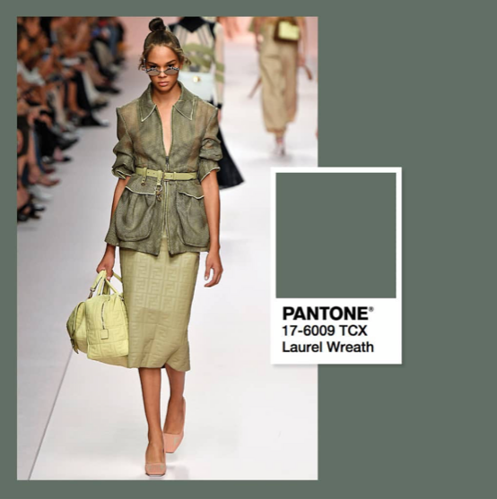
Laurel Wreath
“Restorative and calming, this healthy green invokes a sense of harmony only ever to be found in the natural world.”
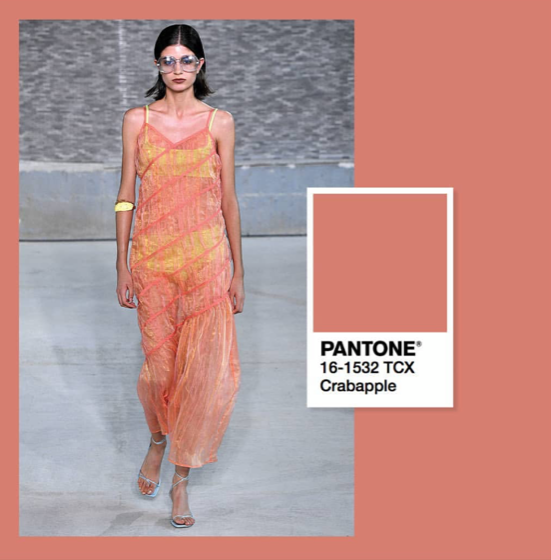
Crabapple
“A gently unassuming hue that instantly envelopes you with its earthy, wholesome appeal.”
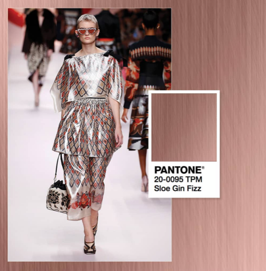
Sloe Gin Fizz
“An enticing glimmer, a warm sparkle; oh to see the world through this sophisticated patina.”
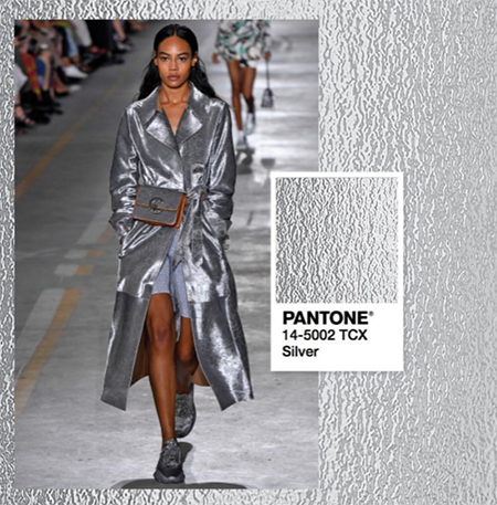
Silver
“Sleek, modern and perpetually relevant, it bridges the gap between the classic and the contemporary.”
All photos: Courtesy of @harrods Instagram.